Brand & media kit

Everything you need to print Arryvz.

Logo lockups, the exact palette, the typeface, and the rules that go with them. Built for the people making our shirts, hats, signage and stationery — take the whole kit, or just the one file you need.

Approvals and anything not covered here: hello@arryvz.com. If a rule isn't on this page, it isn't decided yet — ask before you guess.

Logo

Three lockups, one geometry.

The mark is a navigation arrow that reads as an 'A', with a location pin knocked out of its centre. Every lockup is built from that one shape — viewBox 0 0 100 100, round joins, a 4.2-radius dot.

Horizontal lockup

The default. Letterhead, email signatures, website headers, invoices, anywhere a wide strip is available. Mark 34–48px tall, 14px gap to the wordmark.

Vector viewBox 300 × 64 · PNG 3000 × 640

Onyx on white #FFFFFF

White on navy #0D1526

Stacked lockup

The primary lockup when the space is square-ish: flyers, poster panels, T-shirt fronts and backs, the footer, social avatars with room. Mark height ≈ 3.2× the wordmark cap height.

Vector viewBox 320 × 240 · PNG 2400 × 1800

Onyx on white #FFFFFF

White on navy #0D1526

Two notes on the files, so nothing surprises you at the RIP. The SVG lockups set the wordmark and tagline as live text in Montserrat — install the font, or use the PDFs, which carry it embedded. And the SVG masks the pin out of the arrow; the original hand-off file used a stroked even-odd path, which paints the stroke into the knockout and nearly fills the pin. The files here are the corrected ones.

Color

The palette is locked.

These hex values are the brand. Match to them exactly — no Pantone book or CMYK build has been specified yet, so for anything printed, pull a proof and send it to us before the run.

Core palette

  • Onyx Black#0A0A0A--onyxPrimary text on light; dark surfaces; the mark on light
  • Arryvz Blue#0066FF--blueThe accent. Buttons, links, the mark
  • Blue — hover#0052CC--blue-hoverButton hover; small blue text on light gray
  • Blue — on dark#4D94FF--blue-dark-accentBlue used as text or icon on a dark surface
  • Light Gray#F4F6F8--light-grayLight content surface
  • Border#E2E6EB--borderBorders and dividers on light
  • Slate#5B6777--slateSecondary text on light
  • Slate — on dark#9FB0C9--slate-darkSecondary text on dark
  • Navy 1#0D1526--navy-1Dark card / surface (blue-tinted)
  • Navy 2#0D1017--navy-2Footer and pattern background
  • Navy 3#0A0E16--navy-3Page-dark background; hero gradient start
  • Navy — mid#101B33--navy-midHero gradient middle
  • Navy — deep#0B2A66--navy-deepHero gradient end; brand bar middle
  • Pattern mark#1C2230--pattern-markThe low-contrast marks in the brand pattern
  • White#FFFFFF--whitePage white

Gradients

  • Hero gradientlinear-gradient(135deg, #0A0E16 0%, #101B33 60%, #0B2A66 100%)Dark heroes, flyer panels, magnet grounds.
  • Brand barlinear-gradient(90deg, #0A0A0A, #0B2A66, #0066FF)A 4–6px accent edge on every dark band. Onyx to blue, left to right.

Neutral scale

  • #FFFFFF--n-0
  • #F4F6F8--n-1
  • #E2E6EB--n-2
  • #C9D0D9--n-3
  • #9FB0C9--n-4
  • #7C8798--n-5
  • #5B6777--n-6
  • #3D4757--n-7
  • #1C2230--n-8
  • #0A0A0A--n-9

Status colors

Forms, toasts and badges only. They are not brand colors and they never appear in a lockup.

  • #1B8A5ASuccess
  • #57C79ASuccess on dark
  • #B7791FWarning
  • #FDF0D5Warning surface
  • #F2C15CWarning on dark
  • #C8323CError
  • #FF7B84Error on dark

Typography

Montserrat. Only Montserrat.

One family across the whole brand. It's free under the SIL Open Font License, so you can install it on any machine that needs it — the samples below are the real font, rendered live.

  • ARRYVZ. The journey there!

    400 Regular — Body copy

  • ARRYVZ. The journey there!

    500 Medium — Small text, captions

  • ARRYVZ. The journey there!

    600 SemiBold — Sub-headings, labels, eyebrows, the tagline

  • ARRYVZ. The journey there!

    700 Bold — h2, h3, buttons

  • ARRYVZ. The journey there!

    800 ExtraBold — h1 and the ARRYVZ wordmark

The self-hosted file is a variable font carrying 100–900; the brand uses 400 to 800 and nothing outside it. Italics are not used anywhere in the identity.

The wordmark and the tagline

Arryvz

Weight
800 ExtraBold
Case
UPPERCASE
Tracking
0.14–0.16em
Color
Onyx #0A0A0A, or white on dark

The journey there!

Weight
600 SemiBold
Case
UPPERCASE
Tracking
0.30–0.42em
Size
0.5–0.65× the wordmark cap height
Color
Slate #5B6777 on light, #9FB0C9 on dark. No bullets — the line is set as one phrase.

Brand line

ARRYVZ. The journey there!

This is the brand line, and it is part of the lockup — the wordmark supplies "ARRYVZ", so only THE JOURNEY THERE! is set beneath it. Written out in prose, meta and social it appears in full as ARRYVZ. The journey there! It replaces the retired lockup tagline "RIDE • DELIVER • MORE" and the retired campaign line "A to Z, Arryvz."; there is no separate campaign line. The name is pronounced arrives, always with a capital A, and it is never inflected — no "Arryvzed", no "Arryvzing".

Usage

Four rules and a short list of nevers.

This is the whole of what the brand guide specifies about handling the mark. Anything beyond it is not decided yet — so ask rather than assume.

The Arryvz mark inside a dashed box offset on all four sides by the height of the pin.pin heightpin height

Clear space

Clear space equals the height of the pin, on all four sides. Nothing — no type, no rule, no image edge — comes inside it. In the mark's own 100-unit box the pin measures 29.5 units, so in practice reserve roughly 30% of the mark's height as margin on every side.

28px — dot staysUnder 28px — dot goes

Minimum size

Below 28px rendered, drop the centre dot — the pin silhouette alone carries the mark. That is what arryvz-mark-blue-no-dot.svg is for, and it's the file behind our own favicon. The same logic applies to any process that can't hold a tiny detail: small embroidery, foil, etched glass.

Colorways — these four, and no others

  • White mark on a dark surface.
  • Onyx #0A0A0A mark on a light surface.
  • Blue #0066FF mark on #0D1526 or on white.
  • White mark on Arryvz Blue #0066FF.

Never

  • Skew or stretch the mark.
  • Outline it.
  • Add a gradient to it.
  • Recolor it outside the palette above.
  • Place it on busy imagery without a solid or gradient scrim behind it.
  • Set the campaign line inside the lockup.
  • Set body copy in ALL CAPS — caps are reserved for the wordmark, the tagline and eyebrow labels.

Not specified yet

The brand guide is silent on these, so nothing here invents an answer. If your job needs one, email hello@arryvz.com and we'll decide it properly and add it to this page.

  • Pantone and CMYK equivalents for the palette.
  • Thread colors, stitch counts and embroidery digitising specs.
  • Approved garment colors and blanks.
  • Minimum physical print size (the 28px rule is a screen rule).
  • Co-branding and partner lockups.

Collateral

Which lockup goes on what.

Per-item direction for the things we actually produce. Where a piece has already been designed and approved, the real artwork is linked rather than described.

Recommended logo lockup, colorway and production notes for each piece of Arryvz collateral
PieceLockupColorwayNotesFile
T-shirtStacked lockup, full-chest or centre-backWhite lockup on a dark garment, onyx lockup on a light garment. On an Arryvz Blue garment, the lockup is white.Keep the wordmark and the tagline together — the tagline is part of the lockup. Left-chest placement is small enough that the mark alone usually reads better than a shrunk stacked lockup.Stacked SVG (white) 968 B
Hat / capMark only, front panelWhite or onyx mark to suit the cap; blue mark on a navy (#0D1526) or white panel.Embroidery is where the minimum-size rule bites. The centre dot is 4.2 units across in a 100-unit mark — at a 2 in mark that is roughly 2 mm of thread. Below the equivalent of 28 px rendered, use the no-dot file; the pin silhouette carries the mark on its own.Mark SVG (no centre dot) 471 B
PoloMark only left chest, or horizontal lockup if the placement allowsMatch the garment: white on dark, onyx on light, blue on white or navy.A left-chest horizontal lockup puts the tagline at a size that will not stitch cleanly. If the placement is under about 3 in wide, use the mark alone.Mark SVG (white) 585 B
LetterheadHorizontal lockup, top-leftOnyx mark and wordmark on white, the tagline in slate beneath it.The horizontal PDF ships at 6 in wide with Montserrat embedded, so it drops straight into a template. The 4 px brand bar (#0A0A0A → #0B2A66 → #0066FF, left to right) is the house rule for a dark edge if the sheet wants one.Horizontal PDF 17 KB
FlyerStacked lockup on a dark panel, horizontal lockup on a light oneHero gradient (135°, #0A0E16 → #101B33 at 60% → #0B2A66) behind a white stacked lockup is the house dark treatment.Body copy is Montserrat 400 at a 68-character measure; headlines are 800 and sentence case. Caps are reserved for the wordmark, the tagline, and eyebrow labels.Stacked PDF 19 KB
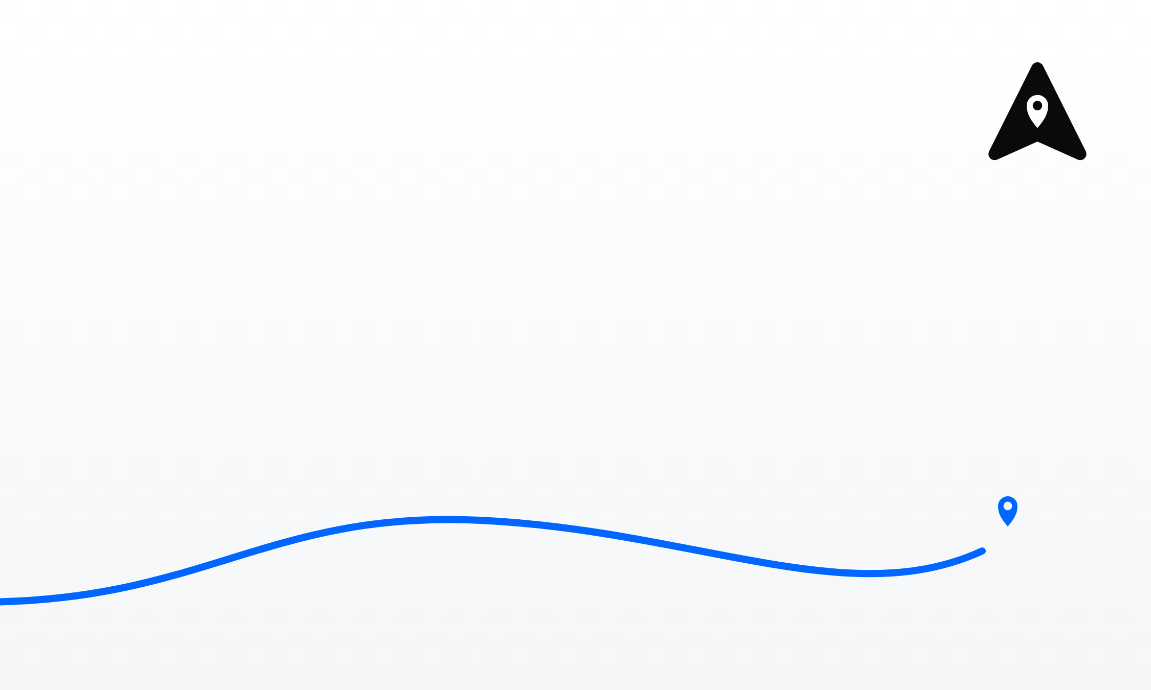
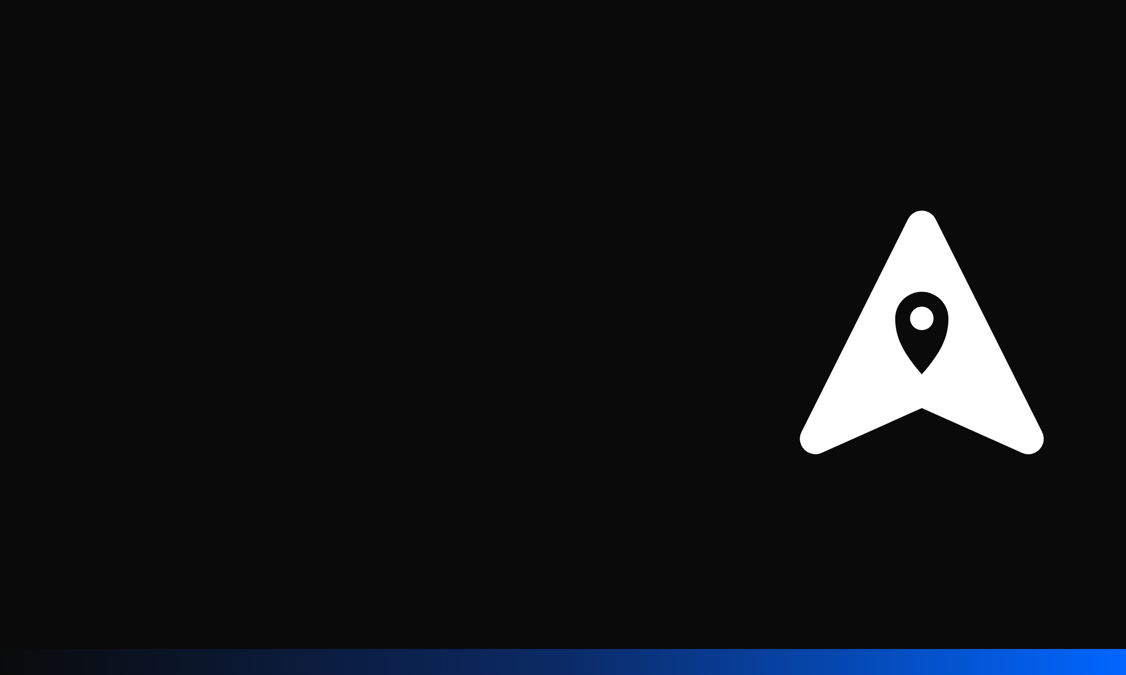
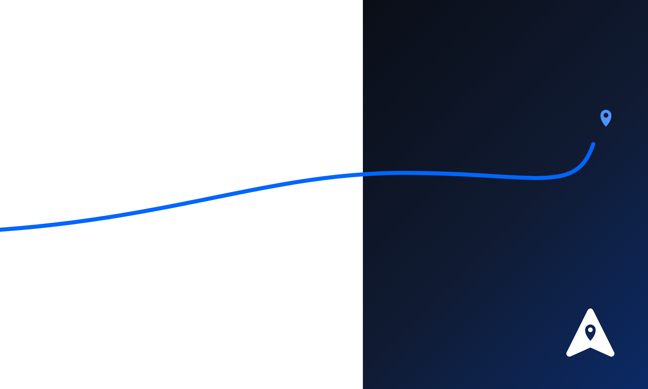
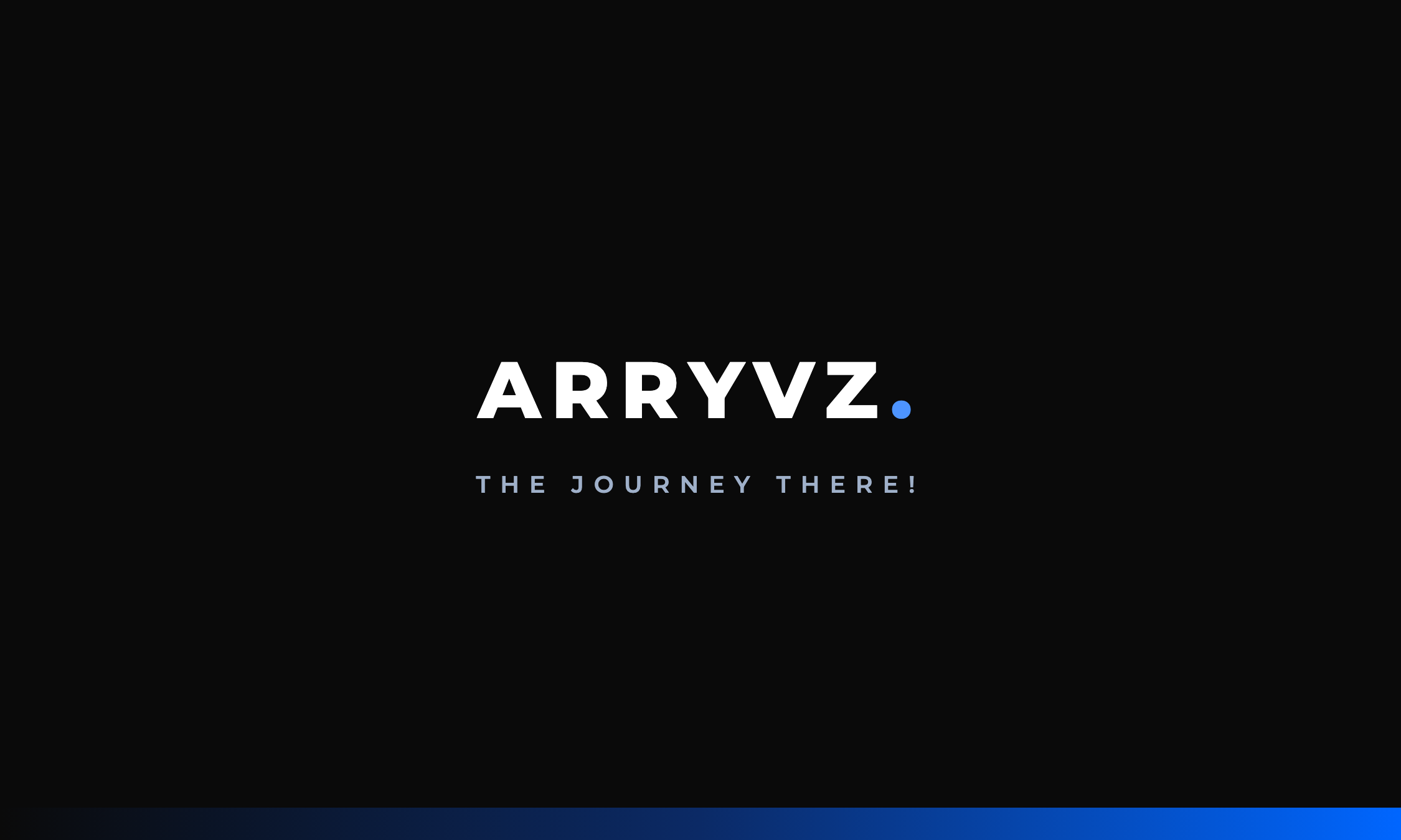
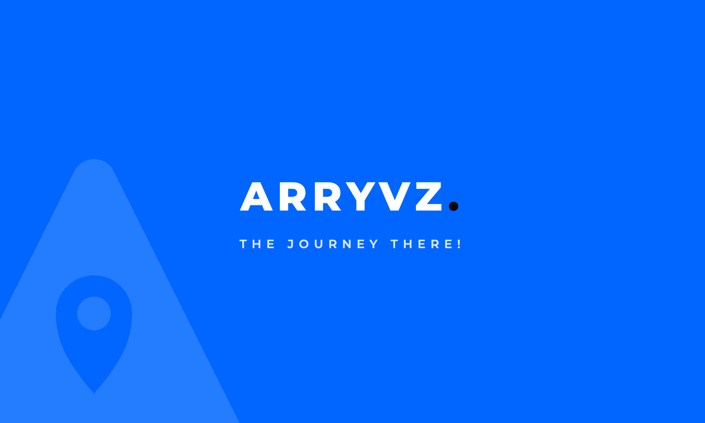
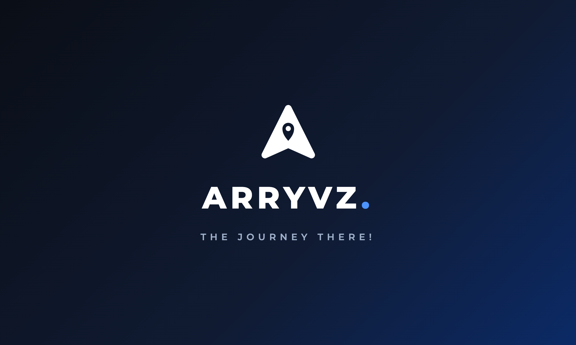
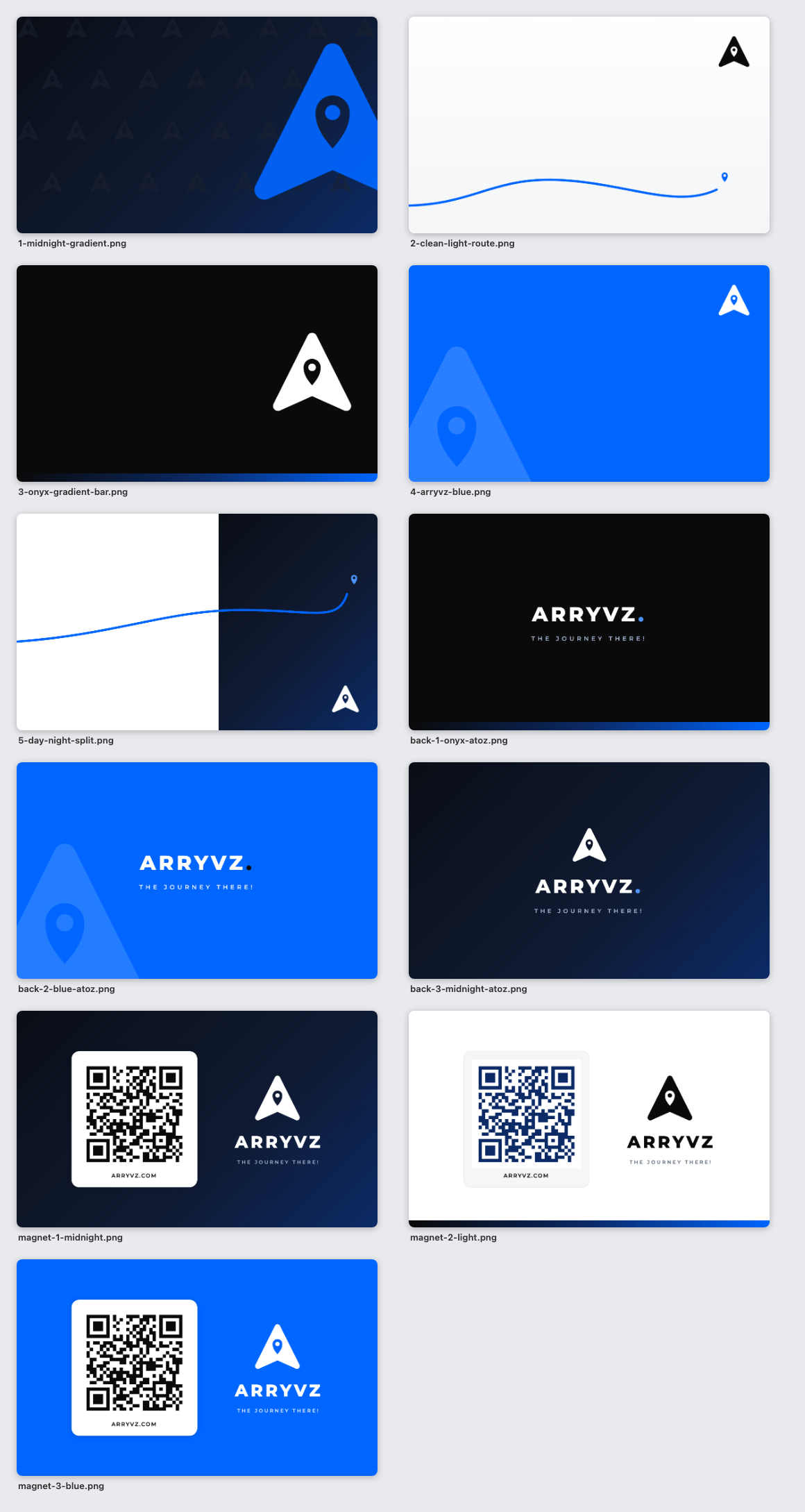
Business cardMark only on the front, campaign line on the backFive approved fronts and three backs already exist — see the examples below.Built at 1125 × 675 rendered at 2×, i.e. 2250 × 1350 px — a 3.75 in × 2.25 in card with bleed at 600 dpi, trimming to 3.5 in × 2 in. The back sets the brand line — "ARRYVZ." at 800 weight above "THE JOURNEY THERE!" tracked at 600.Contact sheet PNG 250 KB
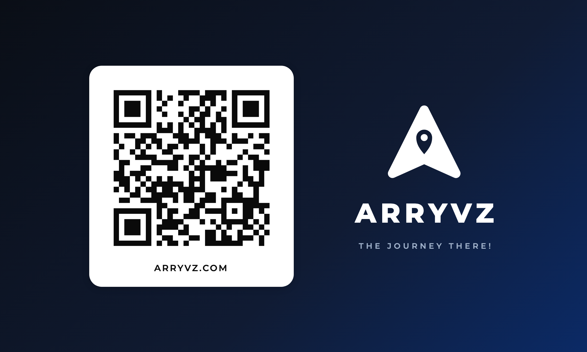
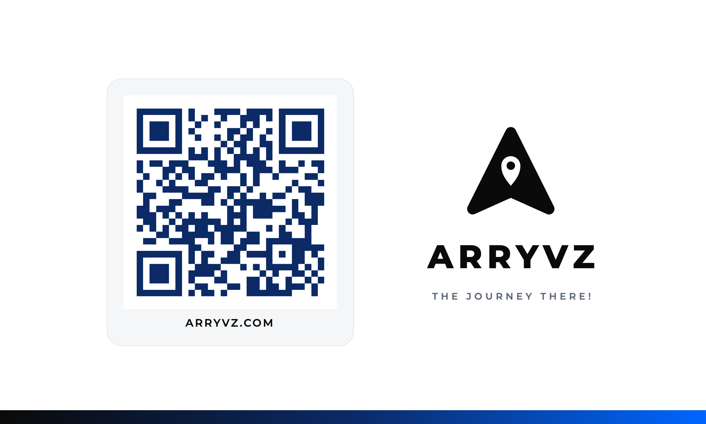
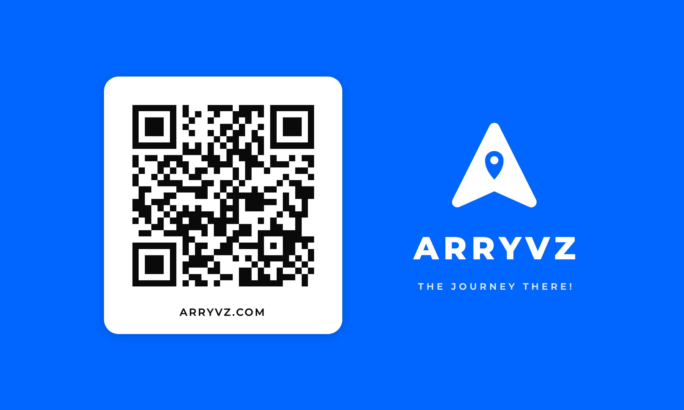
Vehicle magnetStacked lockup beside a QR codeMidnight gradient, white, or Arryvz Blue — all three are produced and approved.The QR code points at arryvz.com/carmagnet, a real landing page. Keep the code on a white or #F4F6F8 tile — never knock it out of a gradient — and do not re-generate it; the artwork below is the approved version.Midnight magnet PNG 786 KB

Business cards — produced and approved

Five fronts and three backs, all rendered at 2250 × 1350 px: a 3.75 in × 2.25 in card with bleed at 600 dpi, trimming to 3.5 in × 2 in. Click any card for the full-resolution PNG.

Vehicle magnets — produced and approved

Three approved treatments. The QR code resolves to arryvz.com/carmagnet, a live landing page — use the artwork as-is rather than generating a new code.

Downloads

Every file, with its size.

The zip below carries all of it. Or take one file — nothing here is behind a form.

Download the whole kit — 3.5 MBLogos, PDFs, the pattern, every produced example, and a plain-text read-me.

Typeface

Montserrat is licensed under the SIL Open Font License, so it ships with anything you make. We don't re-host the desktop family — get it from the source.

ARRYVZ. The journey there!

Send us a proof.

Before a run goes to press or to the embroidery machine, email the proof to hello@arryvz.com. We'll turn it around quickly, and if your job needs a rule this page doesn't have yet, we'll decide it and add it here.